
How to make your brochures stand out from the crowd
Brochures may be old school but they’re still one of the most effective and relevant marketing tools for your tourism business. However, not all brochures are made the same. You may have noticed this yourself when you see a rack of them in the magazine stand. Some brochures simply stand out from the pile; whether it’s because of the eye-catching cover, beautiful layout, or compelling fonts.
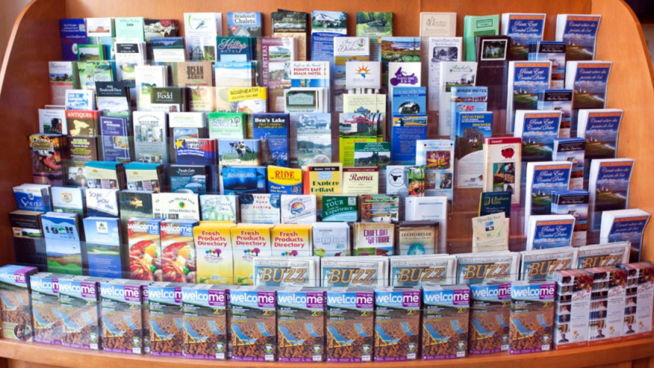
But how do you make your brochure stand out from the rack?
Use the right colours
The psychology of colours applies to almost everything in marketing. In a sea of blue, yellow will stand out. If most brochures are using yellow, then you can use hues of vibrant red or green. There are no hard and fast rules for this one, and there are no right and wrong colours to use. The only way to know which ones will stand out is to actually go and see the rack yourself.
Visit your local Visitor Information Centre, hotel concierges, and other brochure stands in your area. Analyse the existing colour palettes in use. Find out how you can stand out from the crowd. Bright colours are usually a safe choice but don’t be afraid to be different if that’s what everybody else is doing.
Size does matter
Size matters but that’s not to say that bigger is always better. If your brochure is slightly smaller or bigger than the others around it, then people will be drawn to it. Of course, you want your brochure to be small enough that it’s easy to carry around and large enough to get noticed and not get shuffled from the rest of the pile.
Take full advantage of the size of your brochure by using eye-catching, high-res images on the top half and valuable info with large fonts for the rest of the space. Utilise every inch available with a layout that is easy on the eyes.
Paper Quality
Take note of the style of paper used by other tour and activity companies, especially those in your area. If everyone is using the glossy paper or the standard cardstock, then be unique and choose a matte finish. Matte finishes give your brochure that professional clean look, that’s why it’s commonly used in professional photos. Also, it shows a commitment to quality.
Different designs for different target audiences
You don’t need to commit to one design for all markets, as every city or region may have a slightly different demographic from others. If most tourism businesses in your area publish brochures focusing on families with children, then try something different. Create brochures that target a different demographic such as solo travellers, young professionals or couples.
You invested good money in developing unique products, quality customer service, and a convenient online booking system. But something as simple as having a stand out travel brochure could be the secret to getting more bookings.
Keen for tourism insights in your inbox?
Tourism Accelerator will keep you in the loop with our insights and key opportunities for you to grow your tourism business. We promise we won't overload you!
